Web designing course in Dehradun with 100% job bft technology line
Jan 20th, 2024 at 05:32 Software Development Coders Dehra Dūn 416 views Reference: 1173Location: Dehra Dūn
Price: ₹40,000
ABOUT WEB DESIGN
Web design refers to the design of websites. It usually refers to the user experience aspects of website development rather than software development. Web design used to be focused on designing websites for desktop browsers; however, since the mid-2010s, design for mobile and tablet browsers has become ever-increasingly important.
A web designer works on a website's appearance, layout, and, in some cases, content.
-
Appearance relates to the colors, typography, and images used.
-
Layout refers to how information is structured and categorized. A good web design is easy to use, aesthetically pleasing, and suits the user group and brand of the website.
-
A well-designed website is simple and communicates clearly to avoid confusing users. It wins and fosters the target audience's trust, removing as many potential points of user frustration as possible.
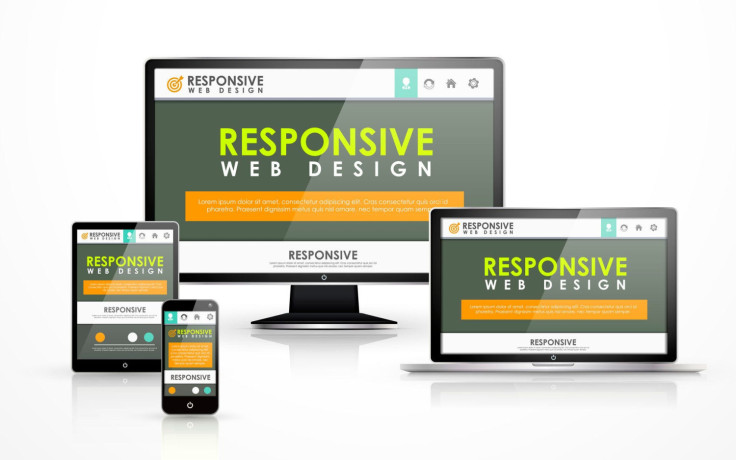
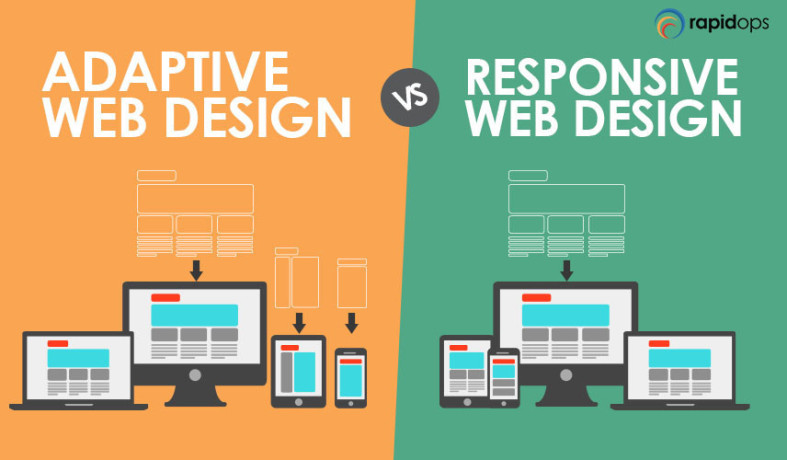
Responsive and adaptive design are two common ways to design websites that work well on both desktop and mobile.
response web design
Responsive designs respond to changes in browser width by adjusting the placement of design elements to fit in the available space. If you open a responsive site on the desktop and change the browser window's size, the content will dynamically rearrange itself to fit the browser window. The site checks for the available space on mobile phones and then presents itself in the ideal arrangement.
Best Practices and Considerations for Responsive Design
With responsive design, you design for flexibility in every aspect—images, text and layouts. So, you should:
-
Take the mobile-first approach—start the product design process for mobile devices first instead of desktop devices.
-
Create fluid grids and images.
-
Prioritize the use of Scalable Vector Graphics (SVGs). These are an XML-based file format for 2D graphics, which supports interactivity and animations.
-
Include three or more breakpoints (layouts for three or more devices).
-
Prioritize and hide content to suit users’ contexts. Check your visual hierarchy and use progressive disclosure and navigation drawers to give users needed items first. Keep nonessential items (nice-to-haves) secondary.
-
Aim for minimalism.
-
Apply design patterns to maximize ease of use for users in their contexts and quicken their familiarity: e.g., the column drop pattern fits content to many screen types.
-
Aim for accessibility.
Adaptive web design
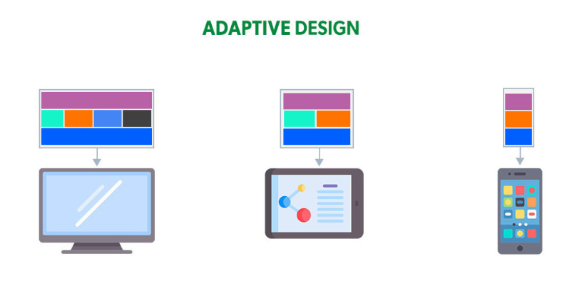
Adaptive design is similar to responsive design—both are approaches for designing across a diverse range of devices; the difference lies in how the tailoring of the content takes place.
In the case of responsive design, all content and functionality are the same for every device. Therefore, a large-screen desktop and smartphone browser displays the same content. The only difference is in the layout of the content.
- Contact us to know more about the course
- email id - wdcourse88@gmail.com


